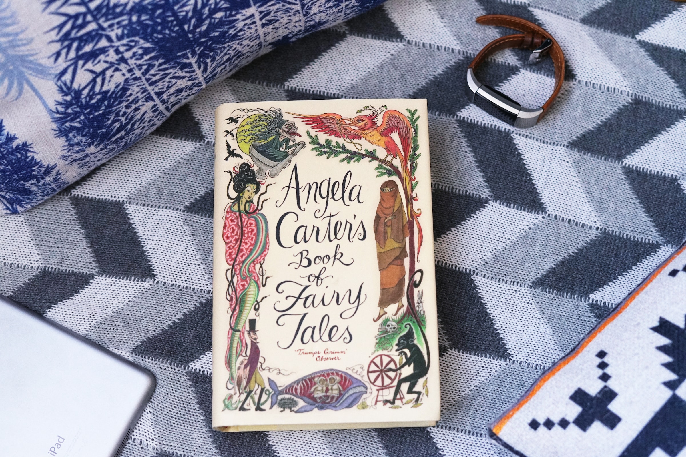
Culture writer Harpal Khambay questions why book covers still play on outdated gender stereotypes and considers how neutral book art could cater to all audiences

“Don’t judge a book by its cover” a common phrase that, quite rightly, reminds us not to judge something by its physical appearance. But, when taken in reference to books, can the same be said? Book covers are thoughtfully designed to reflect the contents of the novel they shroud. They purposefully jump out at you as you peruse the bookshelf, and can be works of art in themselves.
Book covers are the first thing we spot before we even know about the story held within the novels’ pages. If we go into a book shop without a specific book in mind, the cover influences our opinion and prompts judgement before we catch sight of the blurb.
Some of the most striking book covers came from the historical pamphlets of the early 1920s, developed to be eye-catching to a politically receptive world
There are certain cliches and staples of each genre that can easily be recognised, such as, an elaborate font and an image of a weapon for a fantasy novel. A romantic or erotic novel (think fifty shades) might utilise the trope of an alluring silhouette. Psychological thrillers often use the image of a dimly lit street to portray the eerie nature of the story.
A lot of these covers try to apply to a certain gender and therefore play on gender stereotypes. Books aimed at a male target audience tend to be darker in colour, whilst stories considered more feminine are brighter. These stereotypes are rooted in society, and such archetypes that are so well established are hard to shed.
It seems that books do not shed them easily either. We can see this with romance novels and thrillers, which, traditionally, are marketed to females and males respectively. Stories themselves are not gender-specific, so why should their covers be?
It may well boil down to the fact that the covers try to depict an aspect of the novel, and the most central aspect would be the protagonist. Again, stereotypically, and in accordance with gender stereotypes, romance novels usually follow the story of a woman, and thrillers that of a man.
Perhaps the breaking down of gender stereotypes should not be up to the cover art, but up to the author of the novels themselves
However, there are exceptions to these rules, like the character of Katniss Everdeen in The Hunger Games, Lisbeth Salander in The Girl with the Dragon Tattoo and Noah Calhoun in The Notebook. These novels all dispense with the traditional genders that are assigned to certain stories and plots, placing female characters in thrillers, and a male character as the narrator of a romance novel. So, perhaps it is not the fault of the book cover for perpetuating gender stereotypes – but the fault is our own.
In this series, it is not the protagonist that is placed on the front cover but instead simply the colours that reflect the story
Although this series may try to escape gender stereotypes, the colours may fail it slightly. The colours for Lady Chatterley’s Lover are cerise and red, perhaps referring to the overt sexuality of the book. With gender stereotypes in mind, these colours, and titles, would probably exclusively appeal to women. Jane Austen’s novels in the series could fall into the same trap, as the majority are decorated with pastel colours.
One of the most recognisable and iconic book covers includes the original copy of The Great Gatsby, by Scott Fitzgerald, published in 1925. It is certainly beautiful and alluring and manages to convey a sense of grandeur but also deep emotion. The blue background supports this, and the eyes are actually from a painting, named ‘Celestial Eyes,’ by Francis Cugat. Human figures are seen within the yes, to reflect images the characters see in the novel. At the bottom, lights can be seen as a sign of happiness and joviality, which contrasts with the sadness of the floating eyes. It may speak to Gatsby’s innate sadness, despite the lavish parties that he throws. It is incredibly emotive and moving, and may not traditionally apply to one gender, due to the presence of the feminine eyes and blue background.
To Kill a Mockingbird’s original cover is viewed with similar prestige, as it depicts a silhouetted tree against a burgundy background. It represents the tree that the Mockingbird sits in, as well as the plot point in the novel about the hole in the tree. The image of nature also ties to innocence, and particularly the loss of Scout’s innocence as she grows. When discussing gender, perhaps this cover is gender-neutral, and from a plot perspective, it gives virtually nothing away. The novel itself also has its own status and instead is described as a book that all people should read before they die, freeing it from gender conventions on the cover and in the text, giving it a universal appeal.
Is it this type of book cover that is needed to stop the perpetuation of gender conventions? Maybe it is us who need to abandon them and truly embrace the idea that we really should not judge a book by its cover.
Read more from Redbrick Culture:
Comments